So how was the recently concluded annual Salon International de la Haute Horlogerie (SIHH) held in Geneva at the end of January 2013? From what we observed during the watch fair, artistic pieces stood out even more for us this year.
Interestingly, one colour also caught our attention – orange.
Coincidentally, we spotted a butterfly with an orange spot on its wings in our garden upon our return. It was this sighting that inspired our report.
We like the colour orange. According to the website crystal-cure.com, “Orange is a power colour”. It is also one of the “healing colours” stimulating enthusiasm and creativity. We agree and would like to add that it is a lively and exciting colour.
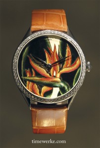
Vacheron Constantin Métiers d’Art Florilège – Queen watch, 2013 collection. The enamel work is by Anita Porchet. Look closely and you’d see her initials: “A.P.” at the six o’clock position. Click on the image for a better view of the guilloché decoration. Photo: © TANG Portfolio at SIHH 2013
One example of an artistic timepiece with the colour orange that livens it up is Vacheron Constantin’s Métiers d’Art Florilège – Queen watch. It features the Strelitzia plant from South Africa and it is brought to life by the clever use of the guilloché decoration and accentuated by the brilliance of enamel colours.
The enamel colours being the handiwork of a well-known enamel master – Anita Porchet. The guilloche work was created in-house by Vacheron Constantin and it added a remarkable texture to the Strelitzia.
The Strelitzia reginae is commonly known as the “bird-of-paradise” flower and there is even an orange Strelitzia which we believe is what is featured on this Vacheron Constantin timepiece.
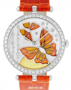
Van Cleef & Arpels Lady Arpels Papillon Orange Solaire, 2013 collection. Photo: © Van Cleef & Arpels
On the Lady Arpels Papillon Orange Solaire by Van Cleef & Arpels, two orange butterflies are in colourful flight thanks to the plique-à-jour enamelling technique on the mother-of-pearl dial while the Sun is represented by a half-circle in paillonné enamel.
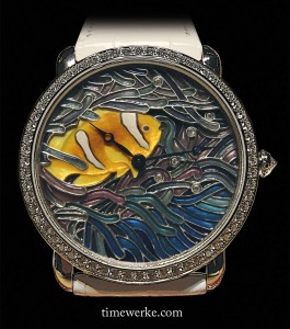
Ronde Louis Cartier XL size watch with a fish and coral motif, engraved mother-of-pearl, miniature painting and plique-à-jour enamel. Photo: © TANG Portfolio at SIHH 2013
Another fine example of artistic work that is unforgettable is the Ronde Louis Cartier watch with the fish and coral motif. Here the orange clown fish or what most would instinctively name “Nemo” thanks to the famous animated movie and the corals are created using mother-of-pearl painting and the plique-à-jour enamel technique.
This Cartier timepiece, together with the Vacheron Constantin Métiers d’Art Florilège – Queen watch and the Lady Arpels Papillon Orange Solaire are highly captivating, more so as jewellery pieces that we practically forgot that they can also tell the time.
What’s more, all three are powered by manual-winding watch movements.
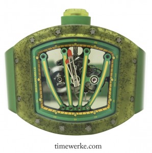
Richard Mille RM 59-01 Yohan Blake tourbillon, 2013 collection. Photo: © TANG Portfolio at SIHH 2013
Another highly captivating timepiece that looked more like artwork rather than a highly technical watch (which it actually is) is Richard Mille’s RM 59-01 Yohan Blake tourbillon. Named after the Jamaican athlete, its green case is a translucent composite made of injected carbon nanotubes which are lightweight and more resistant to steel. Such a composite is used for protecting the movement and the tourbillon from shocks.
Notice the orange-tipped hour and minute hands which provide character to this interesting Richard Mille architectural piece?
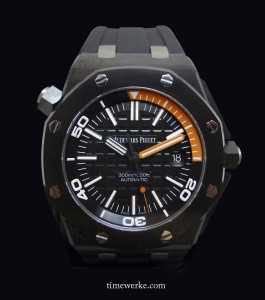
The colour orange is also used on Audemars Piguet’s Royal Oak Offshore diver for the first quarter zone of the inner rotating bezel, the seconds hand and the minute hand. This is a strong handsome piece that is is water-resistant equivalent to the depth of 300 metres.
We like the use of the orange on this piece and one question we have for the brand is why the use of orange for a diver’s watch given that the colour orange will fade out 10 metres underwater.
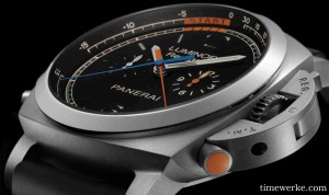
Panerai Luminor 1950 Regatta 3 Days Chrono Flyback Titanio or Pam 00526, 2013 collection. Photo: © Panerai
One highly attractive piece from Panerai is Luminor 1950 Regatta 3 Days Chrono Flyback Titanio. Its uniqueness stems from the fact that orange is used for not only for the central chronograph minute hand but the final five-minutes indicator for the regatta countdown function and the orange chronograph hour hand at the 3 o’clock sub-dial. Even the push-button at 4 o’clock for moving the orange chronograph minute hand is in orange.
This is the first time Panerai is using the colour orange on the dial of its watches, according to what we understand from Alessandro Ficarelli, product development director at Panerai, during his presentation.
While Panerai has its origins as diving watches, the focus of the brand is on sea-sports. Their contemporary timepieces are not generally positioned as diving watches even though the Luminor 1950 Regatta 3 Days Chrono Flyback Titanio or Pam 00526 is water-resistant equivalent to the depth of 100 metres. Therefore, we find the use of orange here as being more practical for higher legibility especially if used during the sailing regattas whether onboard a boat or on land.
Overall, we think the use of the colour orange is spot on in terms of design, notably for the selected timepieces mentioned here. Of course, we have to qualify our opinion as being biased because we do have a liking for the colour orange.


